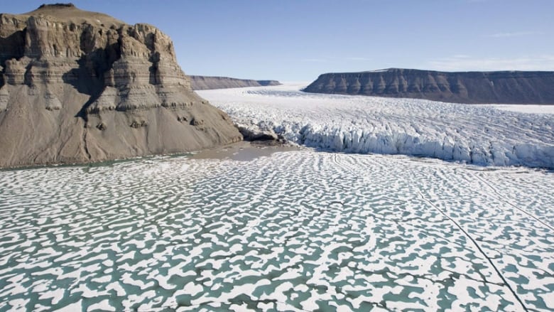
Arctic sea ice gains can be seen on new government map of Canada
More sea ice represented on 2014 map due to 30-year median analysis

At first blush, the newest edition of the federal government's map of Canada will likely surprise some climate-change scientists.
The updated map shows what appears to be more Arctic sea ice than its 2006 predecessor, despite warnings about global warming accelerating the loss of sea ice.
A bloom of textured white covers parts of the Beaufort Sea that looked like bare water on the map from eight years ago.
The difference is that the 2014 map, unveiled this week by Natural Resources Canada, adopts a new way of representing sea ice, explained Yvan Désy, director of the Canada Centre for Remote Sensing.
"The method of calculation is completely different," he said.
The revised methodology follows international standards, with data for the map supplied by Environment Canada's Canadian Ice Service, which provides updated information on ice conditions on navigable waters.
The new map is based on a median level of ice for the month of September over 30 years, when sea ice typically reaches its seasonal low. The period analyzed was between 1981-2010.
- Arctic sea ice hits new record low
- Sea ice loss in Canada's North, 1968-2010
- Download the newest official map of Canada
By comparison, the previous map only accounted for the permanent polar ice, said Denis Dubé, a senior forecaster with the Canadian Ice Service.
Allows for comparisons
"We decided to provide a median over 30 years so we could compare actual conditions, as opposed to just what is represented by the permanent polar cap coverage," Dubé said.
In a way, the previous representation of only the polar ice was "more fictitious," he said, because that level of ice coverage — effectively a "minimum of minimums" — would not be seen year to year.

Dubé said the new map will allow for comparisons of changing sea ice conditions as newer maps become available, rather than only showing the ice cap coverage that has never melted.
Still, some online critics remarking on the apparent gains in sea ice saw something more untoward in the 2014 map.
The lowest period of sea ice on record was in 2012. The sea ice on the 2014 map was created using data up to 2010.
Robert McLeman, an associate professor in the geography department at Wilfrid Laurier University in Waterloo, Ont., denounced the new official map as employing a bit of cartographic "fakery."
But there are many ways to slice the same data, said Chris Brackley, the head cartographer for Canadian Geographic Magazine.
"It's not better, it's not worse, it's just a different graphic approach," said Brackley, who is finishing a circumpolar map to be distributed for free to schools.
"There's a problem with showing something as dynamic as sea ice, which changes from hour to hour," he said.


Brackley's map representing Arctic sea ice shows a September median over many years, similar to the federal government's approach. But for context, he also includes the "true minimum" Arctic sea ice extent reached in 2012.
"My 2012 line is shown like a floating mass sitting on top of the ocean depths," he said. "This median line is a watermark, like a coffee stain of blue, so you can see where it used to be."
Genevieve Marquis, a manager of geoanalytics who worked on the government's map, noted that the next large map to be released next year will represent circumpolar nations, showing a view of the Arctic looking from the top of the North Pole.
She said other changes in the new official map of Canada include the inclusion for the first time of Northern Canada's network of winter roads, and new names reflecting Inuktitut culture for places and geographic features, such as the renaming of Clyde Inlet to Kangiqtugaapik.