Design the most covetable nursery in six simple steps
Learn how to set a stylish yet functional scene for your little one

A nursery is a room that needs to balance form with function, all with an eye on the future – it's also fun to decorate! Designer Sarah Keenleyside knows how to create a functional nursery in the most beautiful way. She stopped by The Goods to show off an Insta-worthy nursery and share some great tips for how you can achieve this look at home.
Start with an accent wall

Start by creating a bold focal point. Nurseries tend to be small rooms and an accent wall is a great way to add whimsy and colour that doesn't overpower the room. If your space is small, you can splurge on a pricier wallpaper because you will use less than an average room. This is a great way to start your design because it sets the tone for the rest of your furnishings and gives you a colour palete to work with if you're stuck for ideas.
Design a nursery with a 5 year old in mind

Let's be honest, the first few months of parenthood are going to fly by. Don't get trapped into designing a room for your newborn with "baby themed" decor. You don't want to spend all of your time and money getting the room ready only to have to change it in a couple of years. You should get a minimum of 5 years out of your nursery. Pick smart furnishings that will grow with you and baby over the first few years. This rug looks like a traditional Moroccan rug but it's actually machine washable, which will to keep it looking great for years to come.
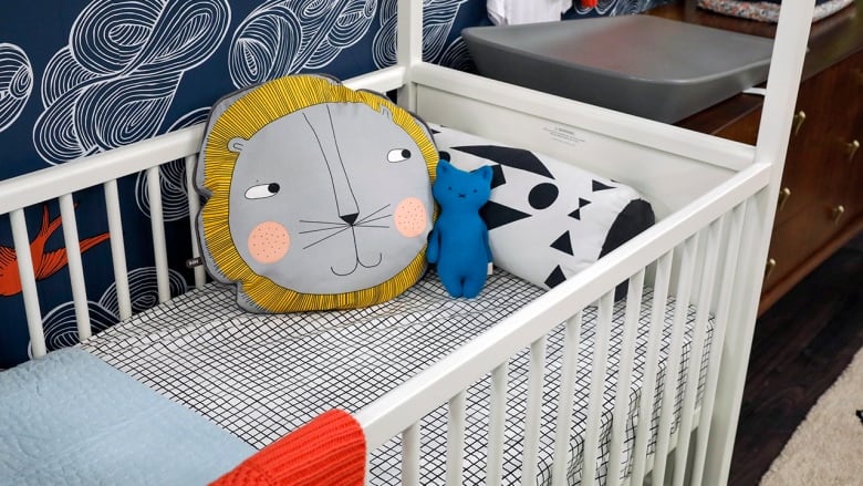
This bed works for all stages, turning from a crib into a toddler bed, and can later be converted into a play tent. Incorporate display areas that can change with your baby's growing interests and that will keep the space up to date.
Don't be a sucker...

Sarah says don't buy the whole bedroom set. Most of the time, the covetable nurseries in magazines are eclectic and don't look like they have been purchased off a showroom floor. The same rule goes for decorating any bedroom: no bedroom sets – for adults or babies. Be practical with what you will need but consider what you are investing in.
For example, you probably need a glider or rocker. This yellow rocker will be much more versatile in the future than a pink rocking chair with elephants on it.

As a rule of thumb, a change table should be 36" tall, or about counter height. There are lots of furniture pieces that provide storage, look awesome and are 36" high that you can turn into a change table. You can purchase a change tray and pad, or a piece with rubber feet on it to keep it from moving, and this will ensure you're not left with a piece that is only intended as a change table.
Look up!

Paint the ceiling a fun colour to add additional interest. You can even wallpaper the ceiling! Think of adding a ceiling medallion and a colourful pendant light. Mobiles are so cute and really easy to make. Removable glow and the dark star stickers are also ceiling classics. Play around with this space, because anything goes!
Accessories

Accessorize with things that are practical and joyful. Everything for kids and baby is usually fun and colourful, so decorating with small items isn't hard. Picture ledges are perfect for displaying your favourite books. Don't worry about things being too precious – you can have family heirlooms in your nursery, just keep them out of toddler reach, which is usually about 3 feet.

Those adorable outfits that your fancy friends gave you that your baby will only wear once can be out on display. Hang some cute hooks on the wall and have your favourite pieces out on so you get to at least enjoy them even more. This is also a great time to think back to what you loved as a child and mix in some of those elements, like some of your old childhood toys (ones that have been checked for toxins!). These little trips down memory lane are fun on those late nights.
Avoid "scheming"

Avoid colour schemes in the traditional sense of the term. Spaces that have chosen colours tend to look corporate; and when you're all done you'll wonder why it feels like it lacks personality. Consider the accent wall of this nursery: instead of using the navy, coral and white of the wallpaper, Sarah paired primary colours of a similar intensity that complement the wallpaper. This keeps the room from falling flat and keeps it from being too matchy-matchy.

Resource guide: